BACK
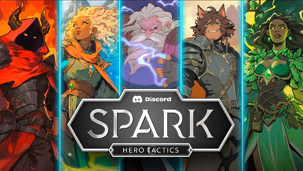
Spark : Hero Tactics
Spark: Hero Tactics is a fast-paced player-versus-player (PvP) card battler that is available as a Discord Activity. You can play with friends or against other Discord users by launching it from a voice channel.

The in-game board UI was designed to balance tactical clarity with environmental immersion. The bridge layout anchors player focus vertically, guiding the eye from hand → lanes → opponent hero. I prioritized legibility of card stats, board state, and turn information while minimizing visual noise against the painterly environment.
Clear framing of lanes and strong contrast in unit states (health, attack, active selection) ensures players can parse complex turns at a glance — critical in a competitive tactics experience.
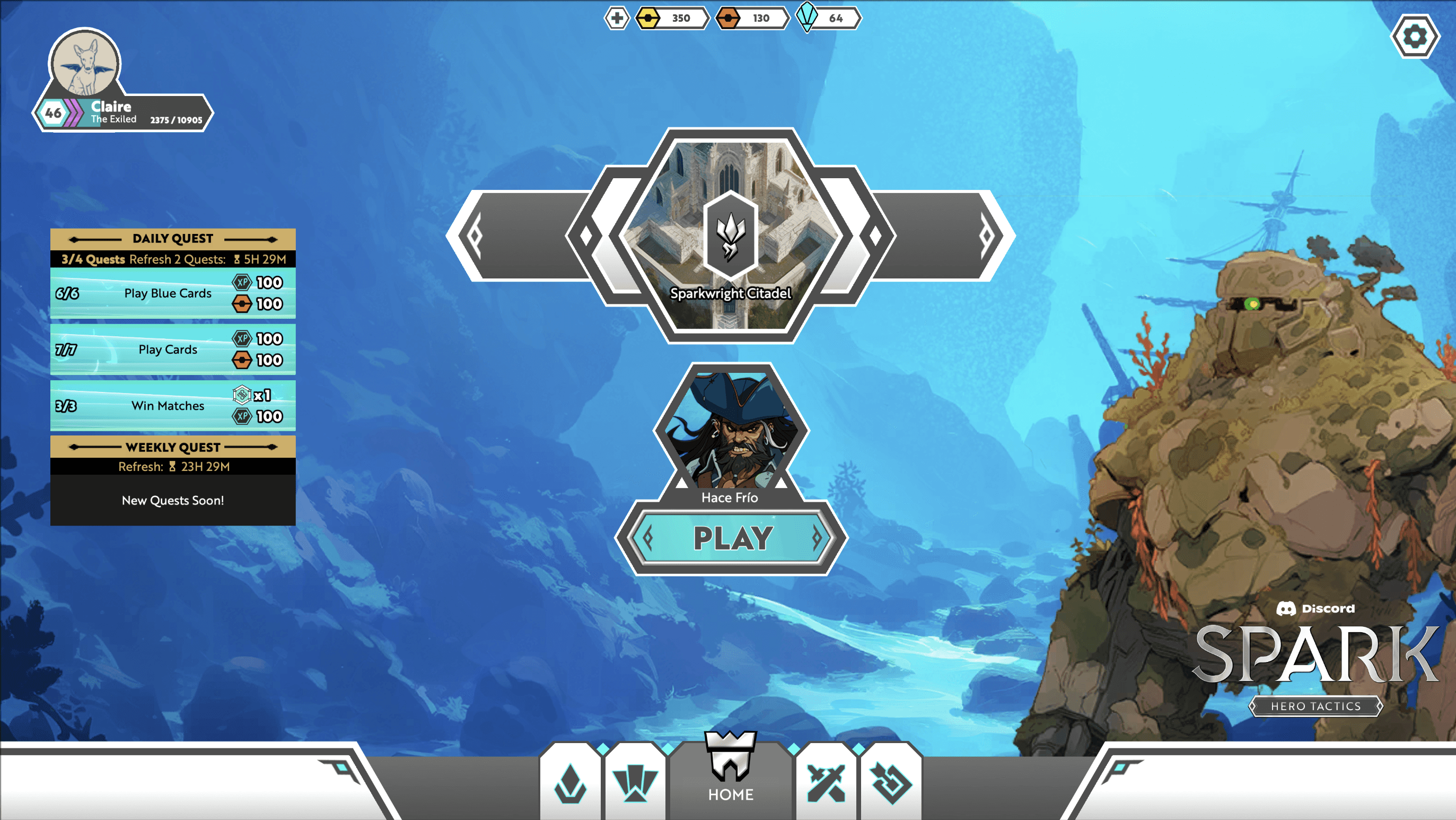
The main menu centers around progression and player intent. With objectives completed, the UI shifts from guidance to empowerment—placing the “Play” CTA at the visual center while surfacing Daily/Weekly quest completion and rewards in a structured side panel.
The hexagonal framing system reinforces the game’s tactical identity, while the bottom navigation bar provides fast access to core meta systems (Shop, Collection, Loadouts). The goal was to make progression feel visible and rewarding without overwhelming the player.

The Collection screen was designed as a flexible system for browsing, deck-building, and long-term mastery. A horizontal hero/deck selector anchors the top, while card groupings (Creatures, Spells, Locations) are segmented for quick scanning.
Visual rarity framing, progress indicators, and card count completion states provide constant feedback on collection growth. The layout supports both casual browsing and strategic deck refinement without requiring deep menu nesting—reducing friction in experimentation and iteration.

The Store UI was built to clearly separate value tiers while keeping monetization transparent and readable. Daily Deals are surfaced prominently at the top to encourage habitual engagement, while pack bundles use strong iconography and color coding to communicate rarity and scale at a glance.
I focused on clean hierarchy: currency balances always visible, pricing clearly labeled, and reward expectations defined upfront. The intent was to create trust through clarity while supporting a live-service economy.